Understanding Color Harmonies
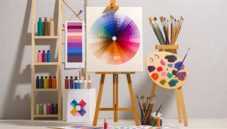
Color harmonies refer to the combinations of colors that create a pleasing and balanced visual effect. There are several commonly used color harmonies in fine art:,1. Complementary harmony: This color harmony involves using colors that are opposite each other on the color wheel. For example, red and green, or blue and orange. Complementary colors create a strong contrast and can make your artwork visually dynamic.,2. Analogous harmony: This color harmony involves using colors that are adjacent to each other on the color wheel. For example, blue, green, and yellow. Analogous colors are often found in nature and can create a sense of harmony and unity in your artwork.,3. Triadic harmony: This color harmony involves using three colors that are evenly spaced around the color wheel. For example, red, yellow, and blue. Triadic colors create a strong visual impact and can add vibrancy to your artwork.,4. Split-complementary harmony: This color harmony involves using one base color and two colors that are adjacent to the complementary color. For example, blue, yellow-orange, and red-orange. Split-complementary colors offer more variation than complementary colors while still maintaining contrast.,5. Tetradic harmony: This color harmony involves using four colors that are evenly spaced around the color wheel. For example, red, yellow, green, and blue. Tetradic colors offer a wide range of color combinations and can create a visually rich artwork.,By understanding these color harmonies, you can choose a color palette that best suits your artistic vision and enhances the overall impact of your artwork.
Tips for Choosing a Harmonious Color Palette
Now that you understand the different color harmonies, here are some tips to help you choose a harmonious color palette for your art:,1. Consider the mood and message of your artwork: Different colors evoke different emotions and have symbolic meanings. For example, warm colors like red and orange can create a sense of energy and passion, while cool colors like blue and green can evoke a sense of calmness and tranquility. Choose colors that align with the mood and message you want to convey through your art.,2. Start with a base color: Choose one color as the dominant hue in your artwork. This can be the focal point or the main subject. Then, use color harmonies to select complementary or analogous colors that enhance and support the base color.,3. Use color schemes or color palettes: There are various resources available online that provide pre-designed color schemes or palettes. These can be helpful starting points for choosing harmonious colors. Experiment with different color combinations to find the one that best suits your artistic style.,4. Consider value and intensity: In addition to hue, consider the value (lightness or darkness) and intensity (brightness or dullness) of colors. Varying the value and intensity within your color palette can create depth and dimension in your artwork.,5. Experiment and trust your intuition: Ultimately, choosing a color palette is a creative process. Experiment with different color combinations, trust your intuition, and don't be afraid to take risks. Remember, art is about self-expression, and there are no strict rules when it comes to color selection.,By following these tips, you can create a harmonious and visually captivating color palette for your fine art.
Conclusion
Color theory plays a crucial role in fine art, and choosing a harmonious color palette can greatly enhance the visual impact of your artwork. By understanding different color harmonies and following the tips mentioned in this article, you can create artworks that are visually appealing, balanced, and expressive. Experiment with different color combinations, explore the emotions and meanings associated with colors, and let your creativity shine through your choice of colors. Remember, selecting a harmonious color palette is an art form in itself, and the possibilities are endless!


