Bold Color Palettes
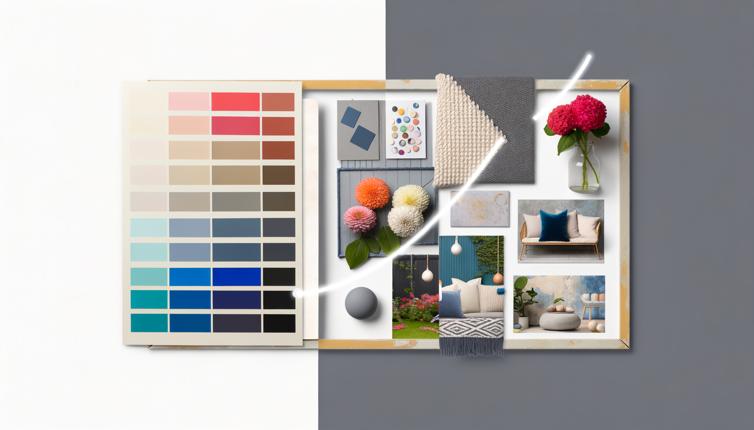
Bold color palettes are characterized by vibrant and intense hues. They are eye-catching and attention-grabbing, instantly drawing the viewer's gaze. Using bold colors can create a sense of energy, excitement, and playfulness in your design.,One advantage of bold color palettes is that they can make your design stand out from the crowd. In a world filled with muted and understated designs, using bold colors can help you make a statement and leave a lasting impression.,Bold colors are also great for projects that aim to evoke certain emotions or convey specific messages. For example, red is often associated with passion and energy, while yellow is associated with happiness and optimism. By strategically using these colors, you can enhance the emotional impact of your design.,However, it's important to use bold colors with caution. While they can be attention-grabbing, they can also be overwhelming if used excessively or inappropriately. Bold colors may not be suitable for all types of projects or target audiences. They can sometimes come across as too bold or amateurish, depending on the context.,When using bold color palettes, it's important to consider the overall composition and balance of your design. Contrast and harmony are key. Pair bold colors with more subdued tones to create a visually pleasing contrast. This will help prevent your design from feeling too overwhelming or chaotic.
Subdued Color Palettes
Subdued color palettes, on the other hand, are characterized by muted and understated tones. They can create a sense of elegance, sophistication, and calmness in your design. Subdued colors are often associated with professionalism and timelessness.,One advantage of subdued color palettes is their versatility. They can be used in a wide range of projects and contexts, making them a safe choice for many designers. Subdued colors are less likely to clash or overpower other elements in your design, allowing for better readability and visual hierarchy.,Subdued colors also have a timeless appeal. While bold colors can sometimes feel trendy and may go out of style, subdued colors have a classic and enduring quality. They can give your design a sense of longevity and ensure that it remains relevant and visually pleasing for years to come.,However, one potential disadvantage of using subdued colors is that they may not be as attention-grabbing or memorable as bold colors. If you want your design to stand out and make a strong impact, a subdued color palette may not be the best choice.,When using subdued color palettes, it's important to pay attention to subtle variations and contrasts. Use different shades and tints of the same color to create depth and visual interest. Incorporate pops of color or accents to prevent your design from feeling too monotonous or dull.
Conclusion
Choosing between a bold or subdued color palette ultimately depends on the specific project, target audience, and desired impact. Both approaches have their own merits and drawbacks. If you want to create a bold statement or evoke strong emotions, a bold color palette can be a great choice. On the other hand, if you prefer a more timeless and versatile option, a subdued color palette might be the better fit. Consider experimenting with different color combinations and gathering feedback to find the perfect color palette for your design.
